To maintain close contact with clients it’s necessary to provide them with a comfortable interaction tool.
In most cases this goal can be achieved by giving customers the ability to fill out data to share any
needed information. Moreover, forms are an integral part of communication and this can be considered as one of
the most common customizations requested in website development and here’s where the problem comes. The standard
way of form creation is costly and gets a lot of time for developers to implement so this can cost an arm and a leg
to enable such functionality.
ProfStep Quick Forms Extension was designed specifically to deal with this challenge
by producing an efficient way of forms creation that can be done without requiring significant resources.
Embark on an exploration of our extension demo, where you can test its
features firsthand and unlock its full potential. Dive into a world of
possibilities as you navigate through the demo, discovering how our extension
can enhance your experience.
Extension helps merchants create a form by providing the ability to create dynamic fieldsets with
custom fields in a quick and efficient way (all in 1 page without reloads).
All the forms can be found in the Content ➔ Quick Forms ➔ Forms List Menu Item.
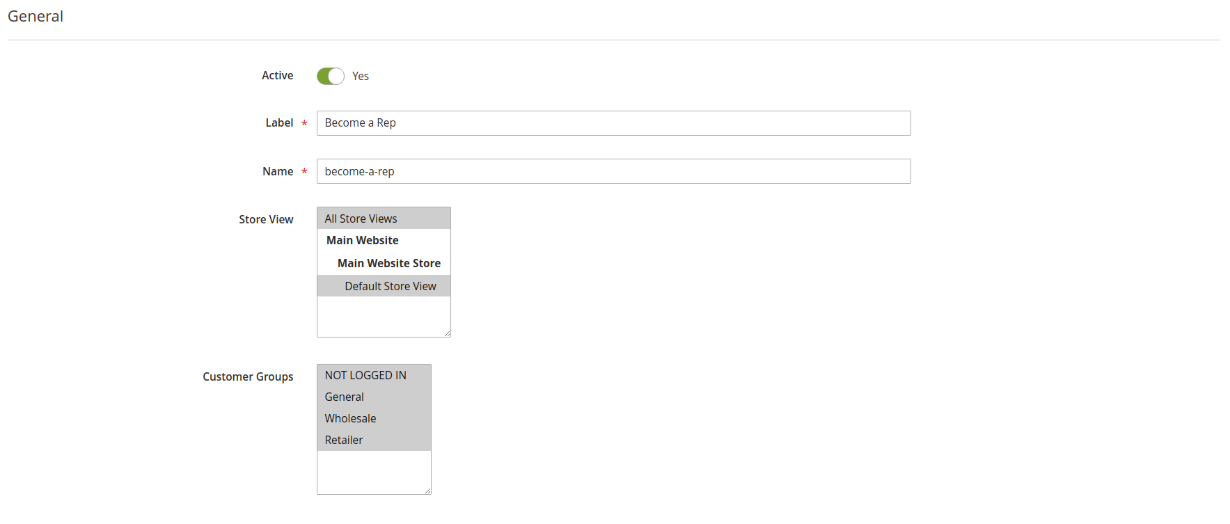
General Configuration
General configurations contain the following main fields:
Active. Determines whether form is active.
Label. Visual form label to be shown on the storefront.
Name. Unique system form name that is used in the forms processing mechanism.
Store View. Restrict store views on which form can be shown.
Customer Group. Manage allowed customer groups.
General fieldset
Content Configuration
Content configuration helps merchant manage basic form contents and consists of the following adjustments:
Description. Is shown below the form name on the storefront.
Success Text. Success message that is shown once form is successfully submitted.
“Submit” Button Text. Content of the “Submit” button (e.g. “Send Form”, “Apply”, etc.).
Content fieldset
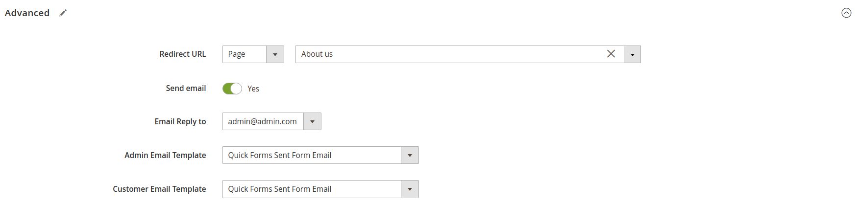
Advanced Settings
Advanced settings contain additional form configurations:
Redirect URL. Allows assign redirect after form submission. The redirect can be directed to a custom URL, product, page, or category..
Send Email. Whether to send email after form submission.
Email Reply to. The admin receiver of the form submission email.
(can be chosen from the emails defined in the contacts store config).
Admin Email Template. An email template to be sent to the admin (Default is Quick Forms Sent Form Email).
Customer Email Template. An email template to be sent to the customer (Default is Quick Forms Sent Form Email).
Advanced fieldset
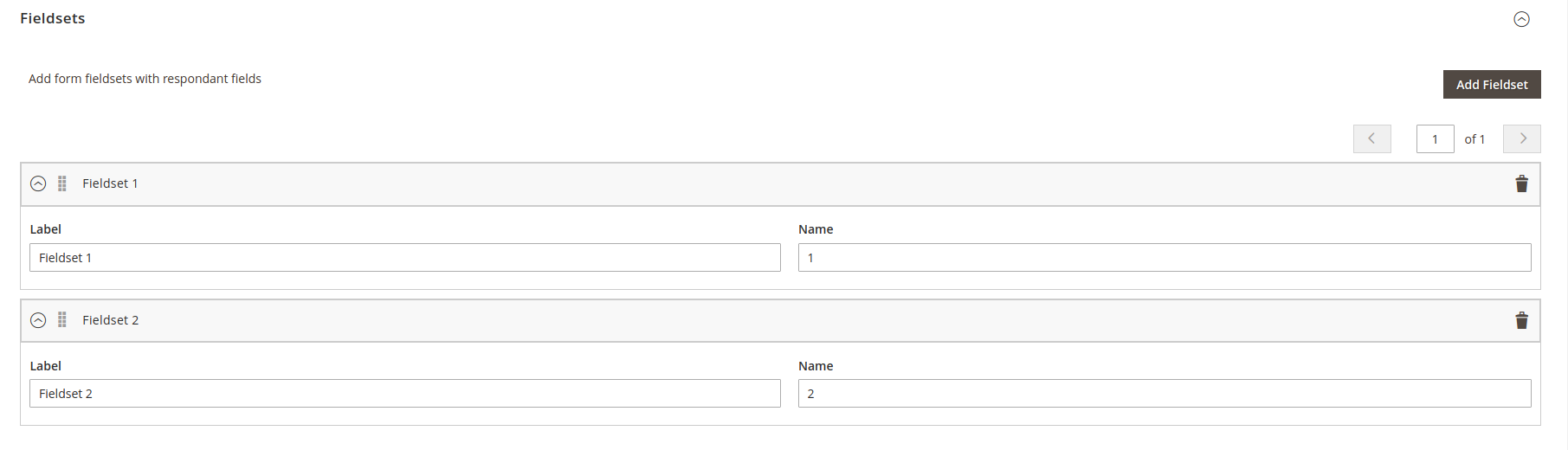
Fieldsets
Dynamic Rows system is realized here giving admins the ability to order fieldsets in a convenient way right from that very page.
Each fieldset consists of the next settings:
Label. Fieldset label, that is shown in the form.
Name. System name to differ fieldsets from each other.
Active. Determines whether fieldset is active.
Fieldsets editing
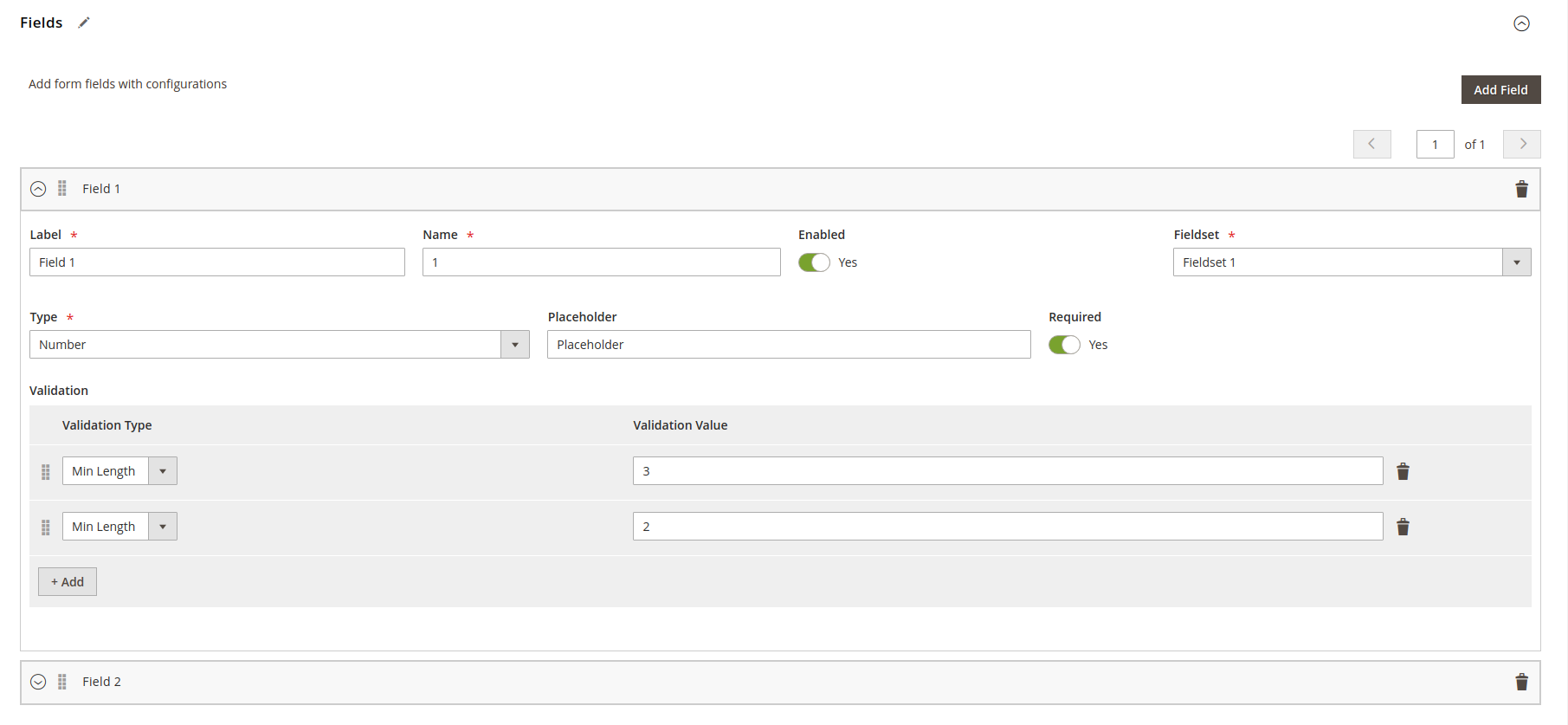
Fields
Dynamic Rows system is realized here giving admin an ability to order fields in a convenient way right from that very page.
It’s worth saying that fields can be managed alongside fieldsets without any need of page reloading or surfing dozens of various pages.
Configurations are listed below:
Label. Field label, that is shown in the form.
Name. System name to differ fields from each other.
Enabled. Flag to determine whether field is shown and active.
Fieldset. Fieldset to assign field to. (Changes to the nearest one in case target fieldset is removed).
Type. Field type.
Placeholder. Content that is shown in place of value in case it is not set.
Required. Flag to determine whether field is required for filling.
Validation. Dynamic Rows system that gives an ability to set validation rules in a flexible way.
Fields editing
After clicking on the ‘Save’ button, the page is refreshed and changes are applied at once and reflected in all usages
Field types
Here is a list of available field types:
Text - input with text type.
Password - password input.
Email - email input with additional email validation..
Number - number input with additional digits validation.
Date - native browser date select.
Select - select field with additional field to configure.
Select Option Dynamic row:
Label - option label.
Value - option value.
Color - native browser color picker.
Time - time input.
Range - range input.
Checkbox - one checkbox with label.
Radio - radio inputs with additional options to configure.
Radio Option Dynamic row:
Label - option label.
Value - option value.
Url - url input with additional url validation.
Phone Number - phone input.
Datetime local - datetime input.
Week - week input.
Textarea - textarea input.
Validation types
All validation powered by jquery validation on frontend and laminas-validator on backend.
Min Length - validates min value length.
Max Length - validates max value length.
Range - validates number values by min-max values. Configured value must contain two integer values separated by dash. Here examples: 18-99, -10-20, -10—5.
Regex - validates value by entered regex pattern.
Additional validation also exists for specific input types:
Email - set on email type field
Url - set on url type field
Digits - set on number type field
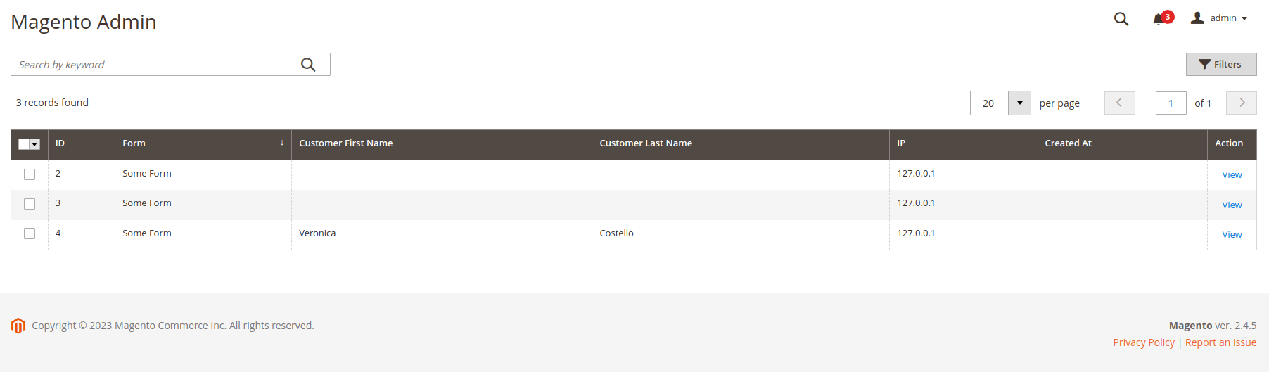
Responses Management
Responses are managed by following the next menu: Content ➔ Quick Forms ➔ Responses list.
List with responses main information is shown there with the ability to view each one with extended info
by clicking on the “View” action.
Responses list
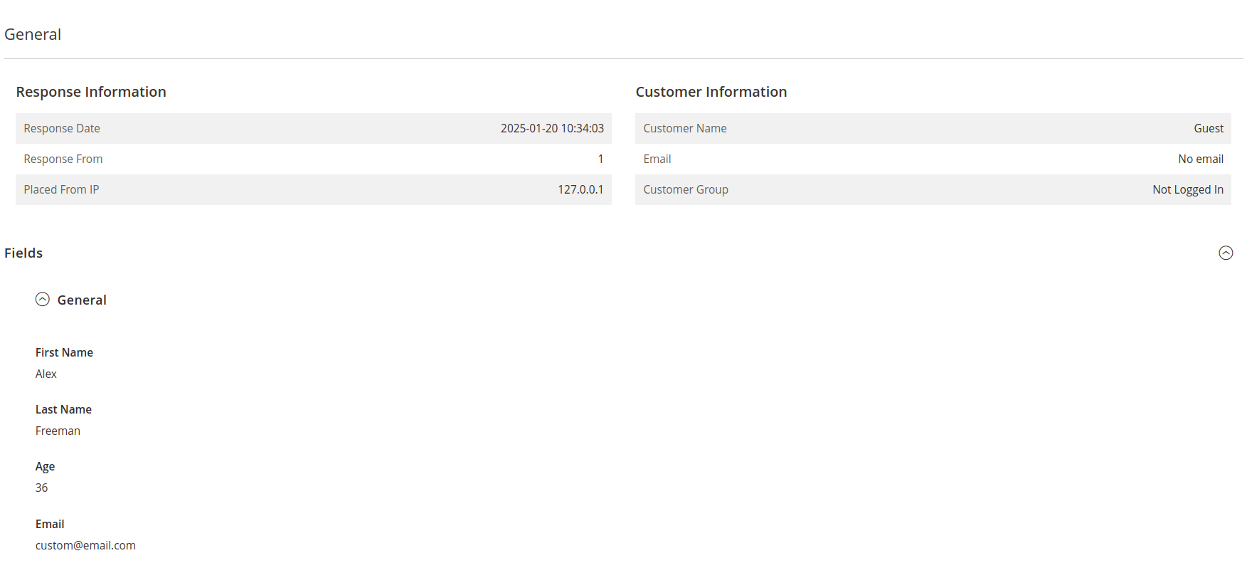
Response page is shown giving an ability to see all the submitted fields structured by fieldsets together with the main
response info provided.
Response information page
Form Display
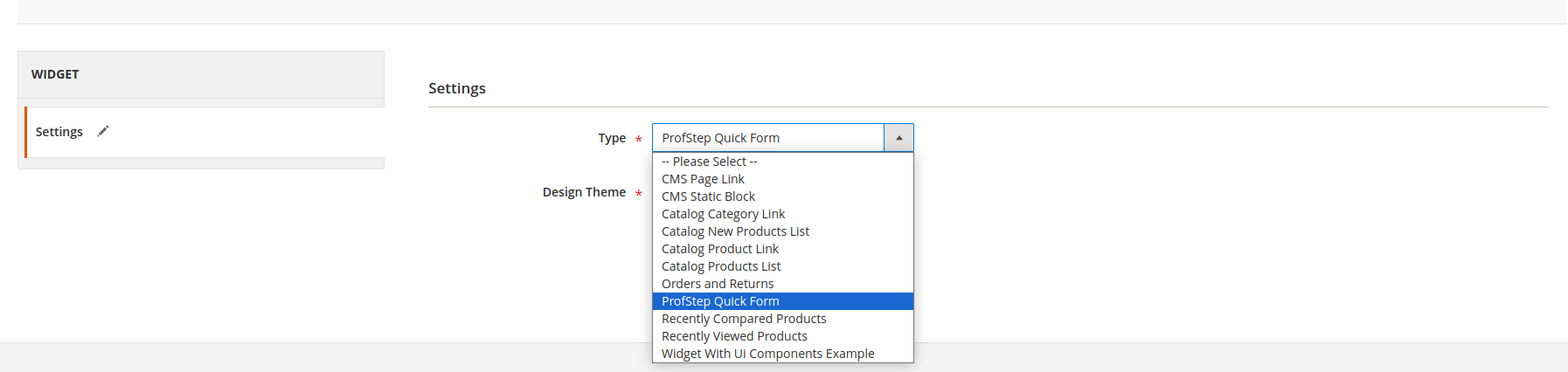
After configuring the form, it needs to be displayed on the storefront. This can be done by utilizing
a Magento CMS Widgets functionality.
In order to do this, follow these steps:
go to the Content ➔ Widgets page and click on the “Add Widget” button to add a new one.
Add ProfStep Quick Form Widget
Go to the “Widget Options” tab and specify a form that has to be used.
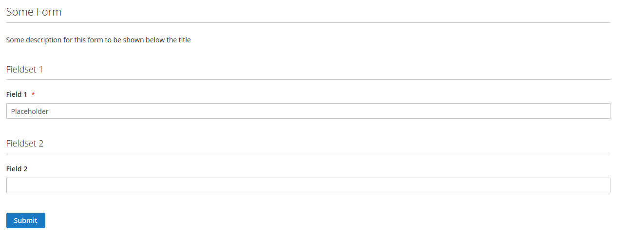
Configured widget is further shown on the storefront giving customers the ability to leave a message, provide more information,
share a feedback and many more
Form displayed on the storefront
Form Responses
All responses are listed on the admin side under the Content ➔ Quick Forms ➔ Responses List path
that can be easily read by moderators
Form Responses List
Response information page
Store Configuration
Forms configuration can be found in the General ➔ QuickForms tab with 2 groups available:
General
Display settings
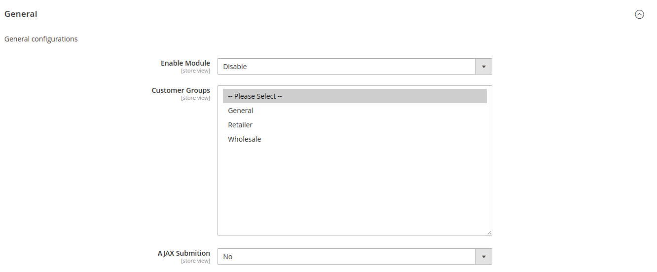
General
All the basic configurations can be performed here.
It has the following settings:
Enable Module. Whether to enable module functionality.
Customer Groups. Restrict customer groups that can view a form
AJAX Submitting. Whether form should be submitted via AJAX in the non-blocking way.
General config
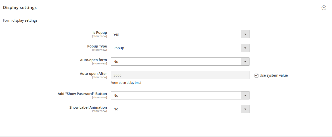
Display Settings
All the look-and-feel of the form can be configured from this group.
Available options are listed below:
Is Popup. Whether to display forms as a popup with the button to open it.
Popup Type. View of modal window. Possible to choose between popup and sidebar options.
Auto-open form. Whether to automatically open forms after a delay.
Auto-open After. Form popup displaying delay. Value is set in milliseconds.
Add “Show Password” Button. Render “Show Password” button near the password type fields.
Show Label Animation. Show animation of label being in place of input placeholder first and rushing up once user is filling data.